
Why we design for the street first
If a sign works at ten metres in Freetown traffic, it works on a phone in Toronto. The reverse is never true.
 Kadi, Creative Director2 min read · September 12, 2026
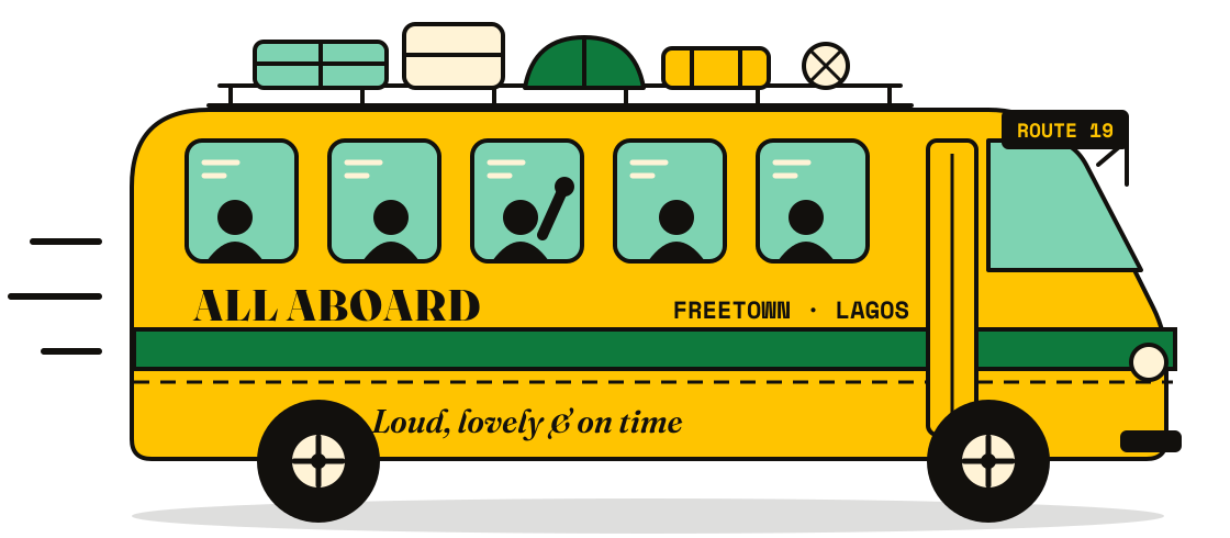
Every poda-poda in Freetown is a billboard with a schedule. Painted slogans, church names, football crests and phone numbers, all fighting for half a second of your attention while the bus swings past. Nobody reads them. Everybody sees them.
That half second is the brief we give ourselves on every project, wherever the client is. Before we open a laptop, we ask one question: what will this look like from across a busy road?
Three rules from the roadside
- One thing, huge. Pick the single word or shape people must remember. Make it bigger than feels polite.
- Contrast beats colour. Dust, glare and cheap screens flatten everything. Ink on yellow survives all three.
- Say it how people say it. If the street calls it “the yellow one”, the brand should lean into that, not fight it.
This is why our work looks the way it does. Five paints. No photography. Big type. It isn’t a style we chose in a meeting. It’s what was left after we took away everything that didn’t survive the street.
“A phone screen is just a very small street.”
Tombo, developer
The surprise was how well it travels. Krio Kicks sold out in London on a campaign built for Lumley Beach Road. Kente Code’s enrolment page works on a three-year-old Android in Accra because it was drawn for a sign before it was drawn for a screen.
So next time a bus goes by, notice what you remember. That’s the part we design first.